I’m no designer, but I’ve come a long way when it comes to my text designs.
When I first started with POD in 2011, I kept it simple. I just centered the text down the shirt and used the same font and size for all the words.
When my Merch Boot Camp Course students send me shirts to review, I notice a lot of them do the same thing with text designs.
If you look at the text designs below, you can see two ways of arranging the same text…
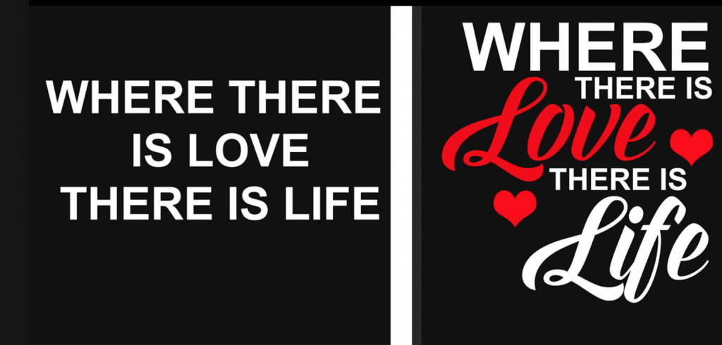
There’s nothing wrong with the first option. Sometimes simplicity sells, but you might want to add a bit of pizazz to make the design pop.
So if you’re thinking, “I could not come up with that idea on my own”, here’s a guide you can follow.
Pair Two Fonts That Work Well Together
There are a lot of different font pairing tips and suggestions online, but my favorite go-to strategy is pairing Script or Handwriting fonts with Sans Serif fonts like the design above.
The words Love and Life use Script, while the other words use a Sans Serif font.
This combo works great on shirts for women and girls.
So what’s a Sans Serif font, you ask?
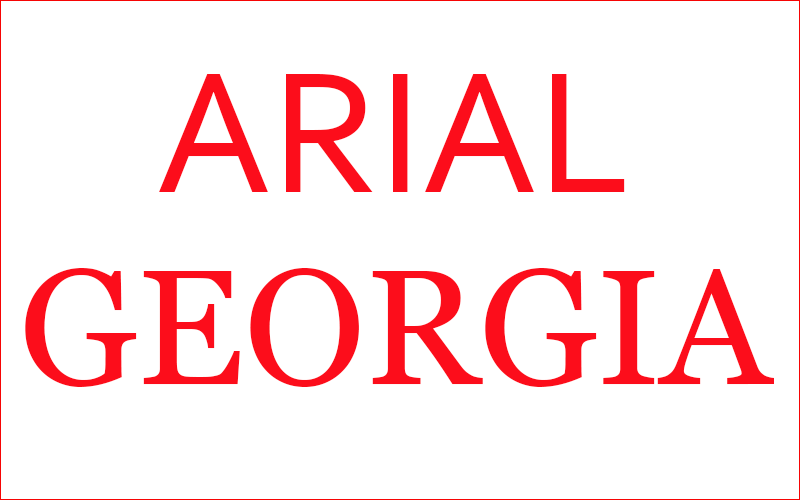
To put it simply, they do not have tails on the ends of the letters, and Serif fonts do. Arial would be an example of a Sans Serif font. Georgia is a Serif font.
Did you also know that software like Photoshop and Illustrator lets you filter fonts by type?
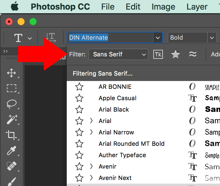
When you select the drop-down menu to choose a font, there’s a filter up top, and you can view fonts by category (Script, Sans Serif, Serif, etc.)
This comes in handy when I’m searching for fonts by group.
Check Creative Market for Fonts & Inspiration
I buy a lot of font bundle packages from Creative Market (no affiliation), and they have some of the best premium script fonts I’ve seen online.
By the way, be sure the font provides commercial use in the terms before you buy.
You can also check the thumbnails on their homepage for ideas on how to lay out text and pair fonts together as I discuss in this podcast.
That site has been a big inspiration for me for text layout and font pairings.
Fill Empty Spaces With Images or Icons
Notice how I added hearts on either side of the text design above to fill in the gaps.
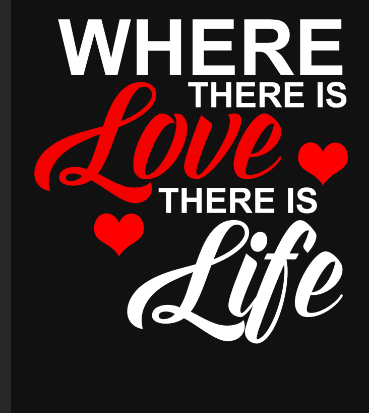
I like to add relevant images or icons to fill up the spaces. This is how the custom shapes tool in Photoshop became my best friend. 🙂
My library is loaded with icons for many topics and niches. They really come in handy for text designs that may need a few accents.
I find them all over the place. I will typically Google something like hat custom shape for photoshop. Sometimes I’ll install individual ones or I’ll buy a premium pack.
My Photoshop course shows you how to install and even create your own shapes for re-use!
Make The Important Words Stand Out
In this sample design, I made the words Love and Life larger and in a different font so they stand out. This just helps the design pop.
I also made the word “Love” red so it stands out the most.

Align The Edges of The Design for Balance
Notice how the text and hearts vertically align to the right of the design?

Now if I had planned to use this design, I probably would have been a little more particular and made the elements balanced on both sides. But I just threw this together quickly.
Maybe something like this…
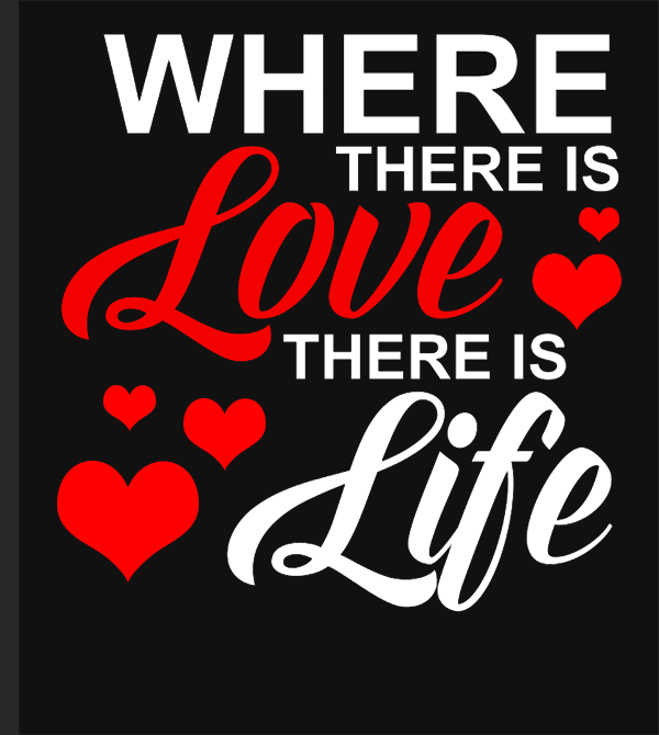
I added more hearts and aligned them to the left edge under the word “Love”.
The design looks more balanced this way.
So let’s sum up the tips again…
- Pair fonts that work well together. Canva has a great article here.
- Fill empty spaces with relevant images or icons like I did with the hearts to represent the word “love”.
- Make important words pop by changing the color, font, increasing the size or make them bolder. You can even make the less important words smaller like I did with “THERE IS.”
- Align the elements in the design to the left and right for balance.
You’ll be amazed at how doing these few simple things can make any text design go from drab to fab!
The more you practice, the better you’ll get over time.
Sometimes I’ll write the text down on paper or a tablet to play with placement and sizing. That helps me get an idea for how I want to lay everything out.
I hope this helps you breathe some life into your text designs! 🙂
I like what you said about filling empty spaces with relevant images. I need to order some t-shirts. I’ll have to consider getting a batch of them imported.
Thank you Lisa, these are truly helpful tips. I’m also not a designer and am trying to get more comfortable with text based designs and I hate everything I do because I have no structure.
Now I do!
Thanks
Lisa, you are one sweet and professional lady and I appreciate you so much.
That’s so sweet of you!! Thanks!
Thanks, Lisa! I signed up for your pro course and am loving it. This article is very helpful as I progress through the course. I know it will take a bit of time and a lot of work, but so excited to be this far along in the process. Thanks again!
Thank you soooooo much Janet! Really glad you are enjoying it! Feel free to reach out to me privately with questions. That’s also what you are paying for and I appreciate your business.
Thank you, Lisa!
Thank you Mitch!
You design board games??? How cool is that? I don’t think I’ve ever met anyone who does that. I’m a board game fanatic by the way.
Hi Lisa, that is a very pretty design (the one with multiple hearts.) I always enjoy reading inspirational design posts like yours. I design board games, some of which can be played on Excel. Design is very key! (I like what I make, but I know it is very basic.)
Cheers,
Mitch